
Responsive. Pixel-Perfect. Code-Free.
Make web design feel like home
Use familiar graphic editor tools to create pixel-perfect Web Pages, and not just mockups. Focus on the creative part, and we'll take care of the rest.


Design freedom
Customize the hell out of your responsive grid and switch between absolute and auto-layout positioning on the fly.

Familiar tools
The comfort of graphic design tools and the power of modern frontend technologies – combined in one seamless experience.

Instant publishing
What would it take to transform your most daring design idea into a live web-page? One click and a couple of seconds.
Only 3 steps standing between you and your best web-page yet
1
Pick a template or start from scratch
2
Use familiar tools to design a web-page
3
Publish your web-page in one click
Top feature
The ultimate web design experience
Hybrid grid
Get the best out of both worlds: switch between absolute and grid-based positioning on the fly, or combine them in one workspace with the extremely versatile Hybrid Grid technology.

Fully customizable

Precise and consistent

Responsive by design
Features
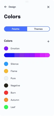
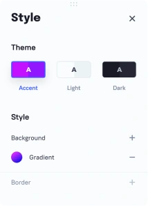
Design system
Create custom presets and introduce changes across multiple projects at any scale necessary.
Animation
Breathe some life into your web-page with stylish, professional-grade animations.
Components
Coming soon
Pack your brightest ideas in custom components for future reuse and improvement.
Publishing
Instantly launch your design ideas into the Web – all it costs is one click.
Create custom presets and introduce changes across multiple projects at any scale necessary.
Breathe some life into your web-page with stylish, professional-grade animations.
Coming soon
Pack your brightest ideas in custom components for future reuse and improvement.
Instantly launch your design ideas into the Web – all it costs is one click.

Web ecosystem
One Vision
One Solution
From an occasional freelance gig to a full-fledged web design studio – Graphite has all the tools necessary to get the job done. Everything you need – packed in one versatile reliable solution.
Get started


Layout engine
Build your website using auto layout and grid tools
Code tools
Embed live HTML code to your website
Design system
Maintain visual consistency of your websites
Content management
Integrate your data from a headless CMS with your website
Asset managment
Keep your images, vector, shapes and icons in one place
Hosting, domains, and SSL
Get your website live
Upcoming features
Roadmap
Done
Сustom domains
Custom domains for your published web-sites
Done
Resize options
Width and height for adaptive resizing
Done
Rectangle
Square and round shapes for web-page layout
Done
Self-align
Align every element within a container separately
Done
Animation
Animate your web-page elements
Done
Templates
Ready-to-go templates to give you a headstart
Done
Forms
Collect and process data that customers submit via your web-site
Done
Section library
Assemble web-pages in a flash using pre-made sections
Done
Animation improvements
Cross-element interaction and new animation options
Done
Performance improvements
An even faster and stronger version of the editor
Done
Tutorials
A vast supply of learning materials to get you started with web design and our editor in no time
Done
Visual components
Create reusable components made of one or multiple elements
Done
Headless CMS
Integrate a headless CMS and enjoy full control of your web-site’s data flow
Done
Links
A neat interface for adding various links
Done
Dashboard update
Improved tools for sorting and managing your projects, as well as some extra options
You’ll love it
Comfort
- Familiar look and feel
- Design system
- Absolute & Auto-Layout
Power
- Top-notch animation
- Pixel-perfect rendering
- CSS/Flexbox firepower
Efficiency
- Bulk adjustments
- Reusable components
- Instant publishing